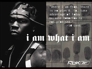
Rbk poster
The close up show us that he is being personal. In addition, the font used is a typewrite to show what he learnt before technology.
Furthermore, fingerprint can show us that he has done a lot of crime in his time to become who he is now. The words "i am" is with 50 cent side and "what i am" to show that he did the crime to become who he is now.
The line in the middle could suggest that there is a good and bad side to him but can also show that he is no longer connect with crime.
50 cent is looking straight at the camera to make the advert more personal and make the consumer feel more connect in what he is saying.
negotiated reading


Some good interpretation of facial expression / pose and colour scheme but you need to link this more specifically to the actual product and the brand identity of Reebok. Why does it use this particular icon? How is it appealing to specific audience? If the consumer is thinking 'how simple life is as a child' what has that got to do with the appeal of the product? You are good at connotation - close up is personal - but then you are lacking analysis - and 'what i am' - push this further.
ReplyDelete